Friday, December 25

Line Style Collagraph Intaglio Printing...a whole different animal.

Okay, relief printing is fairly straightforward and I love it!  But, I wanted to challenge myself and learn another method of printing.  Belinda Del Pesco (whom I've mentioned before) has a great couple of videos on making collagraphs on scrap matboard and then printing in the intaglio method.  This is my best attempt so far, my third try. 

WARNING: This is kind of a technical read. 

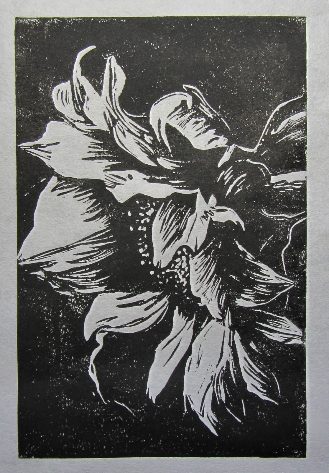
Hand drawn  sunflower, matboard collagraph, black Akua ink with mag mix,  mulberry paper. 

I won't get into all the various print media nomenclature here, but suffice it to say that intaglio is the opposite of relief printing.  You carve the lines you want to hold ink rather than carving away what you don't want to print.  Make sense?

I have not mastered it yet, but thought I'd share my learnings here as it's still a work in progress.


Basic steps are:

1) Draw design on back of matboard
2) Coat all sides of matboard with gloss medium
3) Carve design
4) Apply second coat of gloss medium to matboard
5) Ink the board with intaglio ink
6) Pull your print (These are hand pulled as I do not have a press.)

For Belinda's great detailed video, click here.


Front or Back of Matboard?

The mat board can be any piece of scrap matboard.  Belinda used the back of hers, but I decided to use the front as mine had a brand stamp all over the back.  What I learned was that the line quality you get on the front vs. the back is different and DOES make a difference. More paper pulls off the front so the lines are much deeper.  You can get shallower lines on the back and shallower lines = easier printing. 

My first attempt I had too many incised lines and not enough carved lines to get a good image.   My first two prints are below. I got a better pull the second time but I really had to force the paper down into the carved lines. It did not dawn on me until after my second plate that perhaps the carved lines were too deep. 

Cut Rice Fields, Mississippi County, AR
This is the plate, done on the front of the board.

Wet or Dry Paper?

I used mulberry paper, which is very thin. I was spritzing it but still having trouble. Belinda suggested I try it dry, so I did.  You can see my results below. Dry totally did not work for me. The print had very little line work and still needed more plate tone. 
Same procedure but dry paper.
Next attempt I skipped wiping with newsprint and that helped a little.  (I decided I was just too  heavy a "wiper". Or perhaps my ink was too thick.) I also went back to dampened paper but still had to push the paper into the lines.  It resulted in messy linework, an overall fuzzy look and still very little plate tone. 

But, I will carve this one again as I really love this shot of our old gas station!


Same procedure damp paper. 


Here is the rinsed plate for that print. You can see how much ink is still left in some of the lines. (Gas station, Wilson, AR)
The last element I changed was which side I carve on.  In the third attempt I carved on the back side a simple sunflower (why waste all that time carving when I don't have the technique down yet...duh!), tried to wipe very little and then did a normal print with damp paper. Much better linework but I still wanted more plate tone. 


Ink Consistency


In the final print I tried to dab some ink back on with the wiping fabric. I did not like how that turned out much as it's hard to do without it looking blotchy. The issue is getting big areas of sticky ink off without taking all the plate tone with it. 


Simple sunflower drawings #1 and #2.

Here is the plate for that print.  The brand mark may make more complex designs a challenge.

In the end I believe the only component left for me to change is the consistency of the ink.  So,  after the holidays I will get back on it and try changing the ink to see if I can hone in on a solution. 

Advice is always appreciated so if any of you have experience with this type of collagraph printing I'd love to hear your success story.

As always, thanks for stopping by.


Jan 

Friday, December 18

Relief Printmaking - Linocut Sunflower

Learning Linocut

I have carved many an "art stamp" on Speedy Carve or other soft rubber surfaces to use as original art in my work.  

Recently I decided to step that up a notch and move into printmaking with carved lino.  This is similar to the linoleum that is used on floors, but works great as a relief print process.  There are many Youtube videos on the materials and process for relief printmaking so I won't go into a discussion about all that here.  But, I highly recommend both Belinda Del Pesco and Linda Cote Studio for great tutorials. 

The materials are really very few and this can easily be done without a printing press.


  • Lino block (either mounted or unmounted)
  • Lino carving tools
  • Relief ink (regular acrylic inks don't work well because they dry too quickly)
  • Brayer to apply the ink to the block
  • Paper to print on
  • Metal or wooden spoon, something to rub the back of the paper to transfer the ink.

That's it! Once you have your design carved you can print multiples and leave them with just the ink, or add other medium such as colored pencils, pastels or watercolors. 

I tried the process first with a couple of linocut designs (a cute primitive deer and a carrot) I found on Pinterest just to get my carving skills honed.  They turned out great, but I want to create original work.  

I had a photo of a sunflower that I used for a painting project so I converted it to a black and white photo and used that as my inspiration.  

My goal for this was to create a print that only picked up the highlights of a flower to define it's shape.  After a few tries of carving, doing a trial print, carving some more, another trial print, etc. I finally got it where I wanted it, the final size is 4" x 6".  (And, yes, I forgot to reverse it on the lino so it would print the same direction...lesson learned.)


Other than needing a little more ink or rubbing a bit longer, I really love how it turned out and plan on doing more flowers like this, I can't wait to add a touch of color, although the B/W is great!  You just can't tell it from my photo. 


Thank you so much for stopping by. I would be happy to answer any questions about my process and would highly recommend watching videos from Belinda and Linda.  They have both been so kind in answering my many questions.  Thank you ladies!

More linocuts in my future and I am also working on a collagraph and in the planning stages for a reduction linocut. (More on that later.)  My appreciation for the work that goes into relief printing and intaglio has gone WAY up.

Thank you again!  And if you try a linocut I would love to see your work. 

Jan


Tuesday, September 29

Fun with Jane Davies


I have to tell you what a wonderful time we had in Jane Davies' "Working in Multiples" workshop in Wisconsin two weeks ago!  I learned a lot, laughed even more and made some wonderful new friends.  The weather on White Sand Lake was beautiful most of the week so it was easy to stroll outdoors for a stretch break.


The first of the week we worked on abstract paintings incorporating mixed media and many, many layers while Jane filled our artistic arsenals with tons of techniques.  


Later in the week we created our own collage papers and then developed our skill at abstract collage while learning how pattern, scale, color and value come in to play.


She worked us hard but is fun, energetic, encouraging and generous with her knowledge.  We loved that she called us all "girrrls" and played the jazz ukele as entertainment.  If you haven't taken a class (online or in person) I encourage you to do so if you are interested.  You won't be disappointed, but hurry, as they fill up quickly.

This is just a sampling of some of my work from the class. Some of these will be making it into my Etsy shop soon.  Jane has a post on her blog with many, many anonymous photos of other student work from the class as well as some of her work.  Here is the link: Workshop Photos

I am considering joining Red Bubble and as I think some of these collage pieces would be dynamite as tote bags or contemporary pillows.  What do you guys think? Does anyone out there have experiences with "Red Bubble" or "Society 6"? Feedback is always appreciated.


As always, thanks for stopping by!

Jan
Visit my Etsy shop:  Jypsy Studio

Monday, September 28

Life Gets in the Way Sometimes

Okay, I found that moving 1,000 miles away and starting a new job sure gets in the way of your social media time. In any case, I'm back!  

Here is the long overdue posting of the Spring article that Art Journaling Magazine did on my small little vintage paper collages that I put in a simple ring bound book. I use all original vintage photos and papers in these collage pieces, no photocopies. Hope you enjoy looking.  

Also, I took a workshop two weeks ago from the wonderful Jane Davies and learned so many great things that I cannot wait to try them out on my collages. I will post tomorrow morning details about the workshop and photos of the work we created.  Stay tuned and, as always, thanks for stopping by and I enjoy comments!


Jan
Visit my Etsy shop Jypsy Studio. Also look for me on Facebook, Instagram and Twitter!


Saturday, February 28

Endings & Beginnings

This post is a little more personal than I usually get, but life's major events tend to make us philosophical, don't they? There are two stories here which merge in the end. One about my art and one on a more personal note.

Story #1: I am so excited to announce that my article in Art Journaling Magazine, Spring 2015 will finally run in the April 1st issue.  Six pages in the "Bound for Art" section!!  They confirmed this week. It is about using vintage papers and photos for collage to tell a story.  But, I've found sometimes the story comes much later. 

To help you visualize until I can post the article I randomly chose one of my favorite vintage collages to share. I completed this one several months ago.  It's called "Letters From Home" with vintage papers, a beautiful photo of children, a handwritten envelope from 1900, a "love" stamp and a vintage pen nib. I really love this one! Simple & beautiful. 

Letters From Home

 As you look closely at the bottom of the photo, notice the name of the town..."Wilson". I'd never really noticed that little detail before today. Now, hold that thought for story #2.......


Story #2: You never know when life is going to throw you a curve ball. At my last post I thought I knew where life was taking me.  Two days later it took an abrupt about face and I was faced with major change on every facet of my life. 

 So, if I've been quiet the last month I've just had a few things going on.  Faced with a hurt of the deepest and most personal kind, suddenly I was looking outside the state for a job, preparing to move, renting my house and all that that entails.  This is where Jypsy, my Airstream trailer, comes in. I just LOVE her!!


Meet JYPSY
Jypsy and I immediately went to visit friends in Key West to relax, gain some perspective and come up with a plan. Things started falling into place like clockwork and all of the challenges were getting checked off one by one. Confirmation you're on the right road, right?? 

So, TODAY is moving day!  A lot has happened in 5 weeks. Today I said my good byes and am moving on to exciting new adventures.

And though I hate to move farther from my family, I know they understand it's time for me to go.  Just like a beautiful sunset, at some point it has to come to an end so you can look forward to the next one.


My Key West Sunset
And here is where the stories merge. I'm leaving Florida and moving to a town called "Wilson!"  Go figure.... 

At first I thought "what a funny coincidence" I chose THAT collage, but I listened a little harder. I now believe it is just one more of God's confirmations that he has his best planned for me and was working on my behalf long before I knew.  

They say "Art Heals." I believe that's true, but the process may be different for everyone.  I used to think for me it was in the making of the art.  But work I did months ago speaks to me even today.

As always, thank you for stopping by and allowing me to share some personal thoughts. I will have new art up on Etsy and new tutorials up as soon as I can! Of course that's after I unpack my art supply boxes, which will be first in line!

Sandra Bullock says in the movie Hope Floats "Endings are always sad and beginnings are usually scary, but it's what's in the middle that counts." Make your middle count. 

Jan


Saturday, January 17

Gesso Resist & Stencil Tutorial

Hi and thanks for stopping by! Last week's DLP (Documented Life Project) art challenge was gesso.  I fell in love with using gesso as a resist so thought I'd do a quick video tutorial using three different kinds of gesso.  This is my first video tutorial so be gentle.  :)

Here are a few of the results which I think turned out beautifully!!


LOVE, LOVE, LOVE this one!


I used a combination of Dylusions and Adirondack Color Wash spray inks on watercolor paper.  Details are in the video.  Link below.


These are very easy and quick to do with beautiful results and an easy way to create a starting background for art journaling or for use in mixed media art, collage, card making or scrapbooking!

For details on the technique and supplies used check out my video tutorial on YouTube!


Thank you again for stopping by and I always enjoy comments and feedback below!

Jan


Tuesday, January 13

The Original Documented Life Project-Week 2 Prompt: Gesso

Our prompt for this week was to use gesso. And the quote provided was "The beginning is always today." -Mary Shelley

I love the way it turned out, but it is so much more vibrant in person, the pic just didn't capture it! (Bulb out in my light box...headed to Lowe's now.)

The day I started this my order arrived from StencilGirlProducts which included one of Pam Carriker's face stencils which helped me with the face.  Perfect Timing!!


I normally just use gesso as a primer to keep the ink and paint from soaking into the page as much and to ease in removal of same when I wipe through a stencil. It never occurred to me to use it as a resist...duh...don't know why.  

So, I used it as a resist by sponging through stencils and also used it as my only white paint mixing it with the inks and Golden acrylic paint.  My stencil is a TCW stencil of vintage clock faces.  So, here are some highlights of my process. 

This is the TCW vintage clock stencil I used with the sponged gesso. 


Dylusions spray ink in wild plum and Radiant Rain in teal were sprayed randomly over the page.  You can't see the Radiant Rain shimmer, but it is a really nice combination.


I wanted a face to be superimposed over the clock "faces" so I sketched her in in white pencil with the aid of Pam's stencil.

Gesso was used as my highlights and also to mute the background a little.  It pleasantly reactivated the inks a little bit. 


I was struggling with a way to duplicate the clock face image look on the top layers until Pam Carriker posted her journal page so I have her to thank for the circle and triangle image at the bottom of the finished page above.

A little additional tweaking with Prismacolor pencils and Inktense sticks and voila!
 Now for happy accidents....I started with a trial run on some tags with another stencil and used a variety of medium from distress stains and paints to inks from Dylusions, Radiant Rain and Adirondack (see below).


Here is the stencil I used for these. I think it is a Plaid stencil.

LOVE, LOVE, LOVE the red/orange combo so I did that on a page in my every day journal...and what a WOW!! Adirondack Color Wash in red pepper and sunset orange.


The photo just doesn't capture the brightness, but it looks like that flocked wallpaper from the 70's.  Not sure what's next, but I love it the way it is!

Thanks so much for stopping by. And I always enjoy seeing your comments below.  

Jan


Sunday, January 4

The Original Documented Life - First Prompt: Goals

This weekend I started The Documented Life project which consists of weekly journaling prompts which we share with one another.  It is a great motivator for keeping up a journal and the group is great about sharing photos of their work, tips, advice, tutorials and support. I'll put the link below for anyone interested. 

Here I will share a short visual tutorial of my first week's page with stepped out photos of the process.  I love seeing the process of how other artists arrive at their final destination and hope this provides you with some new ideas to try in your own journal!


I like to start with the end product!


The challenge is to utilize book text and the prompt was "I am my own goal keeper".  Start with a layer of book text, ledger paper, old letters and receipts, etc. adhered with medium of your choice. 

Vintage papers, receipts, ledger pages and a bank note forwarded to me from my friend Cat, 
from her great uncle's store in the early 1900's in NC. 

Add layers with paint, stencils and spray inks. The "text block" is done with gesso to make sure it is easy to write on.


This is the text block filled in 
with a favorite quote.


And one close up shot of a tiny part of the page. I love how the page from the shorthand book shows through the word "goal" here. 


Thank you for reading and I'm happy you stopped by.  Here is the link for The Documented Life Project.


Jan